You don't always need graphics, photos, or images to make your design pop -- sometimes the right font does the trick. But going to every corner of the internet isn't feasible for most designers and marketers. You've got projects to create, often on deadlines that are way too tight. You've also got a fairly strict budget that you can't blow trying to find a font here or there that might work with your designs.
So to help out, we've scoured the internet for you and compiled 28 of the most beautiful and useful fonts to use in your marketing. Bonus: you won't break the bank trying to find one that works best for you. Here's what we found.
Serif
1) Playfair Display
You don’t have to stick to Times New Roman to have your marketing taken seriously. This font is the perfect balance between professional and creative.

2) Gabriela
If you’d like a casual and soft version of a serif font, give Gabriela a try.
3) Della Respira
This serif font is versatile -- it could fit perfectly in a ancient fairy tale or on your latest ebook cover.

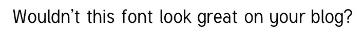
4) Neuton
Like Playfair Display, Neuton is a fairly classic font. Because of its larger, yet more compact width, the font is perfect for mobile.

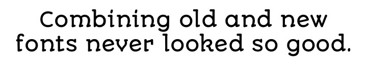
5) Junge
Inspired by calligraphy, this font is elegant, yet flexible. It works for both headers and body copy -- whichever works best with the rest of your design.

6) Esteban
If you want a serif font with some personality, this font is for you. It has varied widths in the font stems (the main vertical strokes in each letter) so it comes across as more playful than typical serif fonts.

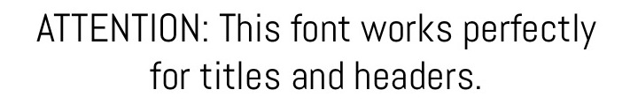
7) Dubiel
This font makes me think of Vogue -- it’s elegant, stylish, and timeless. It could be a great font to spice up your next event invitations.

Sans Serif
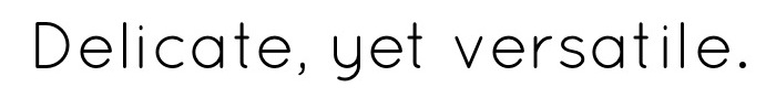
8) Quicksand
This sans serif font is thin and delicate, but it would work well in both body copy and headers.
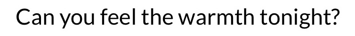
9) Lato
Serif fonts aren’t the only ones that can feel serious. Created specifically for a corporate client, this font is both solid and warm because of its sleek and rounded letters.
10) Abel
This font is modern and condensed, created originally for posters and headlines. Maybe it could work for your next infographic headline?
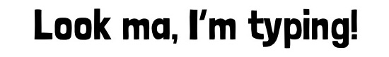
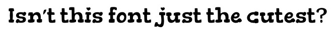
11) Tuffy
A fairly standard, easy-to-read, and fun sans serif font, Tuffy would work perfectly in a long block of text.
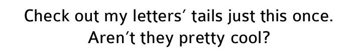
12) Colaborate
A little bit thinner than Tuffy, Colaborate is another fairly classic sans serif font -- with a twist. I love how some of the letters’ tails round out at the end, and some don’t.
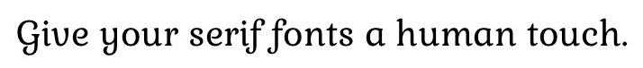
13) Ruluko
This sans serif font could pass for someone’s very neat handwriting -- perfect for adding a human touch to your marketing without looking like you scribbled it yourself.

14) Josefin Sans
This font is thin and very geometric, with a surprise in the letter “z.” Check it out below:

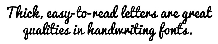
Handwriting
15) Amatic SC
This hand-drawn font would be perfect for a poster or header that needs an artistic feel.
16) Zeyada
If you’re going for that grocery-list-scribbling look, this font is perfect for you. Whatever it lacks in “cleanliness,” it makes up for in personality.

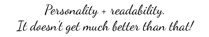
17) Dancing Script
Sometimes it can feel like you’re trading font personality for readability. Not with this font -- it’s both lively and readable.
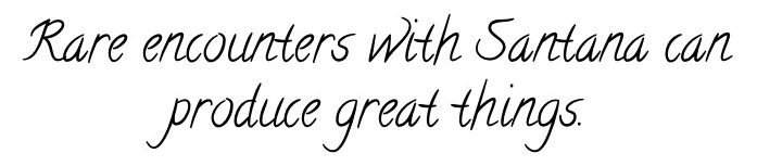
18) Calligraffitti
This font is inspired by the designer’s experience with calligraphy and a “rare encounter with the mood-altering music of Santana” … can you tell? It’s both classic and funky -- perfect for your next SlideShare slide cover.
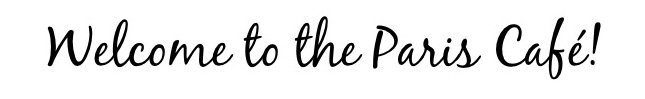
19) BlackJack
Another cursive-style font, BlackJack is friendly and elegant. Can’t you just imagine this on a Parisian café’s menu?
20) Pacifico
Though the cursive letters in this font are bold and close together, it’s fairly easy to read. I’d suggest using this font in a header or subheader as it is too bold and condensed for body copy.
21) Carrington
This font is one of the most detailed in the “handwriting” category. I love the small space between some of the lines within letters -- check out n, m, or h to see what I mean.
Decorative and Display
22) Autour One
This font looks like a modern take on medieval calligraphy -- check out the diagonal points at the bottom of most of the letters. This font is a great way to add an older feel to a new design.
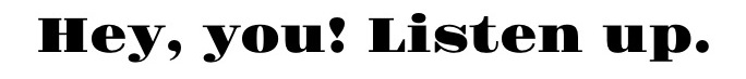
23) Gravitas One
Want to grab someone’s attention NOW? This bold font makes you perk up and listen to whatever the copy says -- right this instant.
24) Londrina
This font reminds me of those block letters you draw in grade school on a science fair poster -- though the font is way more proportional and neat than mine ever were. The hand-drawn feel of the font makes you feel like there’s a human behind the design.
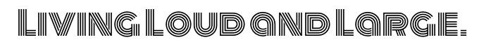
25) Monoton
This font shouldn’t be used for small designs -- it’s made to be large, loud, and proud. It’s kind of trippy with all the three parallel lines in each letter, but it could look great on a Facebook cover photo or Pinterest pin.
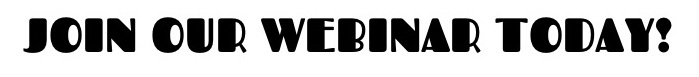
26) Fascinate
This font reminds me of the font used for Broadway show posters. It combines thin and thick letter weighting, which is much easier to read in larger font sizes. This font could be a great way to change up your next webinar invite.
27) Gorditas
Though it’s another take on hand-drawn block letters, this font is more compact and versatile. Bonus: It has hearts above lowercase i’s and j’s for an extra dose of adorable.
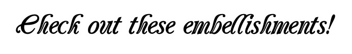
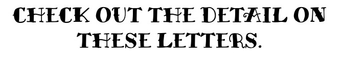
28) Miltonian Tattoo
This tattooish font has lots of intricate details to make your designs look unique. For example, there are little embellishments of curls and points on most of the capital letters -- the perfect way to make your design stand out.
No comments:
Post a Comment