By Pamela Vaughan
You may have caught wind of some of the announcements coming out of the Google I/O conference over the past couple of days. And while we made some high-level observations here yesterday about how this year's emphasis seems to be on context, there was one announcement we thought deserved more of our attention: the complete redesign of Google+.
Uhh ... yeah. Did you miss that? We kind of glossed over it, too. So in this post, we'll pick apart what's different about Google+'s new look -- which Google is rolling out over the next week -- and what these changes mean for marketers like you.
What's New With Google+?
First take a quick look at the changes to Google+ in this 57-second video from Google:
If you can't remember, here's a quick, very recent blast from the past screenshot showing you how Google+ used to look, thanks to TechCrunch:
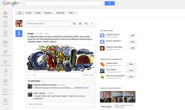
Now onto the specifics. Here's what's new and exciting about the Google+ redesign:
1) Consistency Across Devices
According to a 2012 Google study about multi-screen usage, 90% of people move between devices to accomplish a goal. In other words, people may start reading an email on their phone on the train home from work, but finish reading it at home on their tablet -- or maybe they watch a commercial on TV and then turn to their laptop to research the product. Based on what we know about users' multi-screen habits, it's no wonder Google's design changes to Google+ attempt to achieve consistency across all devices. While the Google+ tablet and mobile apps had already accomplished a consistent look and feel, prior to the redesign, this same consistency had been lacking in the web platform. The Google+ redesign makes the experience across all devices much more cohesive through the following changes ...
2) Multiple Columns
Depending on the size and orientation of your screen, Google+ users may now see one, two, or three columns of content on their main Google+ stream, their personal profiles, and Google+ Business Pages. Here's how this looks on HubSpot's Google+ Page, for example:
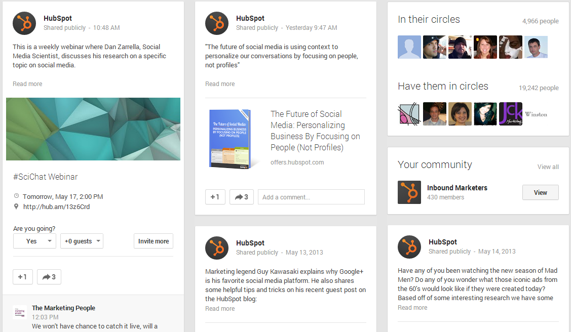
Very Pinterest-esque, am I right?
3) Larger Sized Media
Similar to the more prominently displayed starred content you see on Facebook, Google+ users will notice that certain media content such as photos and videos will sometimes span the width of the full Google+ stream, like you see in the example below. However, it's not clear how Google+ decides which cards (i.e. the individual posts resembling tiles, or "cards") get featured more prominently, and unfortunately, this doesn't appear to be something individual publishers or page admins have control over.
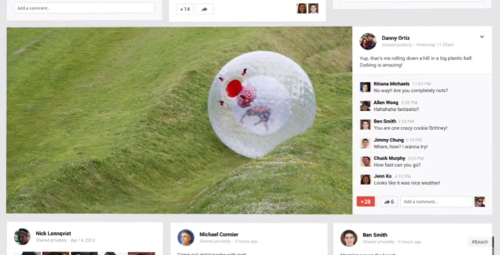
Cover photos, both on personal profiles and on business pages, have been blown up significantly as well (obnoxiously so, in my opinion). As a result, it's important for marketers to make sure the image they use for their business page's cover photo is high resolution. When it comes to sizing, Google+ indicates cover images must be at least 480 pixels wide and 270 pixels tall.
4) Animations
Google+ users will also notice that a lot of features are animated now, boosting the interactivity of the social network. For example, the sidebar navigation slides out from the left when you hover over the home icon on the top left, the sharebox bounces toward the center of the screen, and the cards flip and fade (more on this shortly).
5) Related Hashtags
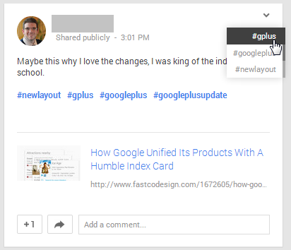
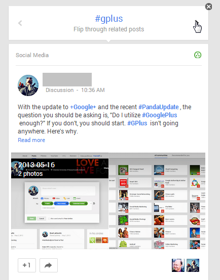
One of the limitations of the former Google+ design was that it lacked depth. While users could scroll up and down to scan posts, there was really no way to go deeper and explore a particular topic even further. The redesign solves for this by automatically adding hashtagsto the content you share. Google+ will look at your post to determine what it's about, hashtag it accordingly, and then rank relevant conversations across the network. When users click on the hashtag, the card flips, and users can browse related content right there (see below). Users can also add their own hashtags or remove the ones automatically generated by Google whenever they want.
6) Stand-Alone Hangouts App
Google+ has also transformed Hangouts into a free, stand-alone application which includes text, photo-sharing, and live video features, available for Android, iOS, and the desktop. The revamped version of Hangouts features richer, more responsive messaging; conversation histories; notifications that sync across your devices (so you only see them once); and free, face-to-face video chatting. It's also available practically everywhere -- download Hangouts from Google Play, the App Store, and the Chrome Web Store, or access it via Gmail or Google+.
7) New Photo Features
The final set of new Google+ announcements has to do with its new photo features, which include cool things like ...
- Automatically backing up pictures taken with your mobile devices, as you take them
- Automatically highlighting higher quality photos and weeding out duplicates, blurry images, and bad exposures
- Automatically enhancing photos to improve elements like brightness, contrast, etc.
- Automatically animating a sequence of photos or grouping photos into a single collage
Here's What We're Dealing With, Marketers
In thinking about the Google+ redesign, I'm picking up three main marketing themes here: 1) an emphasis on context, 2) an emphasis on content discovery, and 3) an emphasis on visual content.
1) An Emphasis on Context
No surprise here, especially given that context seems to be the overarching theme of the I/O conference this year -- as well as a very hot topic for marketers these days. We've talked before about how leveraging contextual information to inform your inbound marketing canmake it much more powerful and effective, and Google+'s new features like related hashtags are clearly aimed to help deliver more relevant and contextual content to its users. As a marketer, use this to your advantage, tagging your Google+ posts with relevant hashtags to make your content more discoverable. Which leads me to theme numero dos ...
2) An Emphasis on Content Discovery
Aside from the element of discovery that Related Hashtags bring to the table, the Pinterest-like redesign of Google+ makes content discovery much easier, surfacing more, better scannable content through the new tiled design. And while it seems like there's an algorithm behind which images and video Google decides to display more prominently, marketers should recognize the chance that the visual content they share may get featured more prominently than text-based content. (Man, these segues are uncanny ...)
3) An Emphasis on Visual Content
With its Pinterest-like resemblance, there's no doubt that the Google+ redesign puts a much greater emphasis on visual content. It's no surprise either, given the effectiveness of visual content in social media. The takeaway here for marketers is pretty straightforward -- invest in visual content creation. Especially considering the chance that Google+ may feature your visual content more prominently, marketers who excel at creating visual content have a better opportunity to stand out from other content in users' Google+ streams.

No comments:
Post a Comment