'via Blog this'
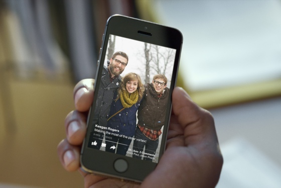
This morning, Facebook is announcing a new standalone iPhone app called Paper. Contrary to earlier rumors, it's much more than just a news-reading app — it's a complete reimagining of Facebook itself. Once you've used it, you may never want to open the standard Facebook app again. It may not replicated every feature of Facebook's main app, but it does fulfill the majority of people's needs. Simply put, it's much, much better.
Paper takes the standard Facebook News Feed and recreates it as an immersive, horizontally scrolling set of screens. It also provides a new way to post to Facebook (and Paper) with an elegant WYSIWYG editor that borrows the styling of Medium's andSvbltle's blogging systems. Finally, yes, it's a news-reading app that owes some of its looks to Flipboard. It will be available for the iPhone in the US (and only the iPhone in the US) on February 3rd. It's also ad-free, at least for now.
That's all more than we were expecting when we sat down with product designer Mike Matas and product manager Michael Reckhow. Neither would quite take the bait when asked whether this should serve as a replacement for the original Facebook app (or, as I put it during our interview, a virtual indictment). Reckhow says that there are "tools that were out there for sharing high-quality stuff and also the tools where you could reach an audience," but that too often they aren't the same thing. "We felt you shouldn't have to choose between one or the other," he says.
GOODBYE BUTTONS, HELLO SWIPES
Paper cuts away virtually all buttons and other UI elements to make every status update, photo, and news story appear full-screen. To get around, you will need to learn a basic set of gestures, but the app will gently remind you what they are if it thinks you're stuck. Wide photos pan as you tilt the phone (the team cheekily calls it the "Ken turns" effect), UI elements often just fade away, and news stories are presented in Twitter-esque cards.
The lack of chrome to help place you in the app and tell you how to navigate can be a little disorienting. On the bright side, the UI is fast and fluid, thanks to the nine months the team has spent working on the app. Loren Brichter, the creator of Letterpress andTweetie, also chipped in on the coding. The result is an app that shares a family resemblance to Facebook Home on Android, but is much faster and more full-featured.

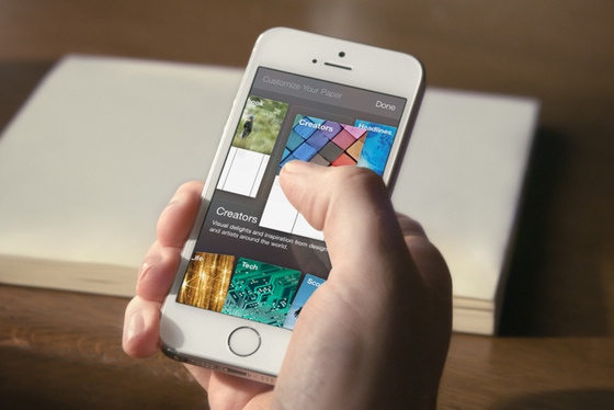
Each section in Paper has a main screen with a cover photo and a list of small cards at the bottom. You can scroll through or drill into the cards, at which point you'll be swiping through one card at a time. Matas hopes that you'll flip through slowly. "You really want people to spend a little bit of time with it and appreciate that content," Matas says, "almost like when you go to a museum and you spend a little bit of time with each thing."
A LEAN-BACK EXPERIENCE, BUT ON A TINY SCREEN
If you aren't put off by the idea of considering a photo of your friend's dog an art piece, you might call it a lean-back experience (albeit on a tiny screen). As a UI philosophy, this stands in direct opposition to the high-volume, high-noise vertical feeds we're used to on Twitter and Facebook. It definitely means it will take longer to grind through content like you can on Twitter — but for Facebook, that's exactly the point. If, like me, you're a news addict and an information fiend, Paper may be a little too relaxed for you.
The interface for news reading is exactly the same, with the exception that links are automatically turned into small, Twitter-esque media cards with branding from the publication. Swiping up to read the full story takes you to the source site — there's no offline mode like you might find in a more full featured news app. You also can't add any site you want, as with a traditional RSS reader. Instead, Facebook has hired a team of content curators to pick stories for you in one of a dozen or so categories ranging from basic news to cute animals.
You can post to Paper (and thus Facebook) in a new kind of compose screen. It shows you exactly what the final post will look like, and Reckhow isn't shy about his hope that people will think of Paper as a new kind of thing — even though the plumbing underneath is still Facebook. "Think about when Instagram came out and you now had this new way to share," he says. Facebook’s ambition with Paper is to have it become its own thing, not just a different way of accessing Facebook. Matas goes so far as to say that "it’s a publishing tool, a way of publishing great content, and a way of viewing great content."

Paper is the first product to come out of Facebook Creative Labs, a unit within the company tasked to "innovate and build new things," as Reckhow puts it. That's likely a sign that Paper will be just one of what CEO Mark Zuckerberg called "new and engaging types of mobile experiences" on yesterday’s earnings call. Since its embarrassingSnapchat clone called Poke failed, Facebook seems closer to figuring out the right formula for its single-use apps. Facebook knows that mobile users are gravitating towards such apps, and it intends to create more of them.
FACEBOOK WANTS ANOTHER SPOT ON YOUR HOME SCREEN, AND ANOTHER ONE AFTER THAT
That’s probably a good thing, and perhaps a necessary one. From a user's perspective, Facebook’s current app is beset by dozens of options, nooks, crannies, and features that most people don’t really use. The recent "tab-centric" redesign helped simplify things, but it wasn’t radical change. Facebook has a billion users, and so any alterations it wants to make to its core app need to be tested — extensively. That kind of testing can get in the way of creative design. "You can’t be innovative if you’re encumbered by worrying if you’re going to disrupt what hundreds of millions or a billion people are doing," Reckhow says.
The team wanted "to have the creative freedom to go outside of what we’ve done and not worry about if it’s going to impact metrics [on] day one." For Reckhow, Matas, and the rest of the team, Paper is less a replacement for Facebook’s app than a chance for the company to try out something very different from what it’s done before — and get another icon on your iPhone’s home screen in the process.
If Paper does score a slot on your main home screen, another app will probably have to be buried away somewhere else. For a lot of people, Facebook itself will be a prime candidate.

No comments:
Post a Comment