by Ginny Soskey
When I started my first job, I did everything mytiny marketing team needed at a moment's notice. Although I was more experienced in blogging and social media management, I was soon pulled into design projects. One day I was mocking up an infographic; the next, I was designing an ebook, and then the day after, I was creating and ordering custom die-cut stickers ... and I was woefully unprepared.
I had no idea what the difference was between HTML and CSS, JPEGs and PNGs, or fonts and typefaces. When I was speaking with our in-house designer or an outside contractor, I felt so silly. I knew what I wanted the design to look like, but I had no idea how to communicate what I meant in designer-speak. It felt like a foreign language.
To help myself function in this brand new environment that needed me to be up to speed -- fast -- I had to fake it until I made it. I started compiling words I didn't know into a personal little glossary that I could whip out at opportune moments, and over time, I started to feel more comfortable with design terminology.
I knew I couldn't be the only marketer who needed to become fluent in designer-speak. So I decided to compile a larger glossary to help us all step up our game a bit. By no means is this the be-all-end-all of design terminology … so feel free to add your definitions in the comments as well. Here's what I have, organized alphabetically.
A
Alignment
The positioning of your the elements in your design (e.g. text, images, etc.). These elements can be aligned to both the page and to each other.
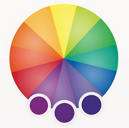
Analogous Colors
On the color wheel, analogous colors are those that lie on either side of any given color.
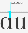
Ascender
An extender on a letter that appears above the midline.
B
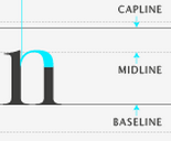
Baseline
The invisible line on which all of a typeface's letters sit.
C
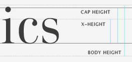
Cap Height
The distance between the baseline and the top of uppercase letters.
CMYK Color Model
Stands for cyan, magenta, yellow, and black. This set of colors is used in print design because of the way paper absorbs light.
Color Wheel
A circle of colors that shows relationships between primary, secondary, and tertiary colors.
Color Schemes
Also known as color harmonies, color schemes are the combination of two or more colors from the color wheel.
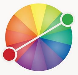
Complementary Colors
Colors that are directly opposite of each other on the color wheel.
Contrast
The accentuation of differences between colors, shapes, spacing, or any other design element.
Crop
When you remove the outer-parts of an image to reframe the subject matter or resize the image's aspect ratio.
CSS
A piece of code that is used to designate the look and feel of a website, separate from the actual content of the web page.
D
Descender
An extender on a letter, appearing below the baseline.

Dots per Inch (DPI)
Similar to the pixel for the web, dots are the smallest unit of measurement when printing digital images. DPIs refer to the resolution of a printed digital object.
Drop Shadow
A visual effect that displays a graphic as if it has a shadow behind it.
E
EPS
A file format used for vector images that contain both text and graphics.
Extenders
The part of a letter that extends above the x-height or below the baseline.
F
Feathering
A design technique used to smooth out edges of a feature.
Font
A typeface in one specific style and size. An example would include Times New Roman Semi Bold in size 14.
G
GIF
Pronounced jif (like the peanut butter), this image file format is best used for small image files with few colors and designs. Bonus: you can make GIFs animated!

Grid
A purely hypothetical map of vertical and horizontal lines that helps align images and text within a document.
H
HEX Code
A code used in HTML and CSS to designate a specific color, usually appearing after the pound sign (#).
HTML
The computer language used to display content like text, images, and links on the web.
Hue
What most people think of as "color" -- red, orange, yellow, etc.
J
JPEG
An image file type that uses lossy (see below) compression, with little perception in a loss of quality. This type of file is best used for photographs and realistic paintings where there are smooth transitions between colors.
K
Kearning
The space between individual letters.
L
Leading
The space between lines of type.
Lossy
A form of data compression where detail is deleted as the file size is decreased. A usual lossy compression method is JPEG.
M
Midline
The distance from the baseline to the top of most lowercase letters, including “e,” “g,” and the curve of “h.”
O
Open Type Fonts
The current standard in font formats. It contains both the screen and printer versions in a single file, and is compatible for both Windows and Mac. The file extension is .otf.
Orphan
A opening line in a paragraph that appears alone at the bottom of a page, or a word or very short line that appears by itself at the end of a paragraph.
P
A file format best used to represent documents and presentations.
Pixel
The smallest element of an image on a computer.
PNG
An image file format that's best used when you have large areas of uniform color or images with transparent backgrounds (unlike JPEG).
R
Rectangular (or Tetradic) Colors
Four colors that are two pairs of complementary colors.

RGB Color Model
Standing for the colors red, green, and blue, the RGB color model is used for web design because monitors transmit light in those colors.
S
Saturation
How bright or intense a color is.
Serif
A small line attached to the end of a stroke in some fonts.
Shade
How much black is mixed in with the hue.
Split-Complementary Colors
Similar to complementary colors, split-complementary colors involves the base color plus the two colors that lie next to its complementary color.

Square Colors
On the color wheel, four colors are spaced evenly from each other.

Stem
The primary vertical stroke in a letter. It’s used in the letter “B” and the diagonal line of “V.”

Strokes
The lines that make up letter in a typeface.
T
Tail
Descending stroke in a letter that’s often decorative. For example, in the letter “Q.”
Terminal
The end of a stroke that doesn’t include a serif.
Tint
How much white is mixed in with the hue.
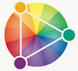
Triadic Colors
Color scheme where three colors located at 120 degrees from each other are combined. Often considered the best color scheme.
Typeface
A design collection of characters, including letters, numbers, and punctuations. Examples include Times New Roman, Helvetica, and Arial.
V
Vector Image
Instead of using pixels to represent images, vectors use lines and shapes. Because they do not rely on pixels, enlarged vector images still maintain image clarity and quality.
Visual Hierarchy
A design principle that visually emphasizes certain parts of your content’s message by using colors, sizes, and layouts.
W
Watermark
An easy-to-see marker placed over the top of photos on the web and in print. It is used to identify the owner of an image and prevent visual content theft.
Weight
In typefaces, the thickness of the stroke’s width. Some examples include demibold, light, and bold.
White Space
The blank space surrounding an object in design. Also called negative space.
Widow
When the end of the paragraph spills over into the following column or page, the section of text that spills over is called a widow.
X
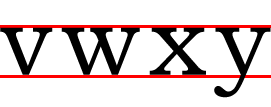
X-height
In a letter, the distance between midline and the baseline.
Z
ZIP file
A file format that compresses many other files and combines them into a single folder. Compressed files do not lose any data to become smaller and are easily restored by unzipping the ZIP file.


No comments:
Post a Comment