by NEIL PATEL on MARCH 4, 2013
In mobile marketing and optimization circles, “responsive design” is more than just a buzzword. It’s a standard that’s taking everything you know about web design and turning it on its side…literally.
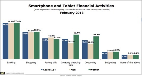
As it turns out, 9 out of 10 smartphone users conduct some form of financial activity on their devices, according to a Prosper Mobile Insights Survey. That includes over half who use their phones to shop online. Although conversion rates on desktop computers are still higher, tablets aren’t too far behind.
What’s interesting is that even though conversion rates for smartphones are still below 2%, the smaller the screen, the more money users spent on average.
One point to keep in mind is that most sites are still not optimized to handle mobile traffic. As responsive design becomes more and more intertwined with best web design practices, shoppers will become more comfortable shopping on a variety of devices, and companies will get used to catering to customers through a variety of channels dedicated to those devices.
A good example of this is WebUndies.com, a family-owned retailer of underwear, sleepwear and loungewear, reported that its mobile commerce sales alone topped $168,000, or 5.4% of its 3.1 million in sales. If that barely seems like a slice of traffic worth optimizing for, consider that this is an increase of over 169% for the retailer. WebUndies uses both a responsive design and a tablet-optimized catalog. With this much attention to its mobile shoppers, it’s no surprise that their mobile traffic has doubled year after year for them.
What is responsive design?
Responsive design is a flexible, liquid layout that adapts to fit a variety of screen sizes, resolutions and devices. Rather than having separate individual design elements that are built for a mobile site, responsive design focuses on a core set of code that aligns and situates itself to flow within the parameters of the device itself.
Consider this example showcasing cabins for rent:
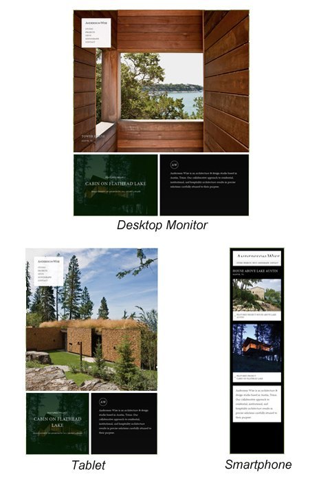
As you can see, the layout adjusts itself to present information in a way that makes sense for the device it’s being viewed on.
But the real question from a conversion standpoint is: what do I keep, and what do I trim away?
Conversion elements worth keeping
Keep anything that makes it easier for mobile customers to find what they’re looking for quickly. That means maps and directions, business hours, and tap-to-call functionality that puts them in touch with a representative.
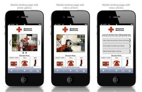
The Red Cross’ mobile site is a perfect example of integrating mobile features in a way that makes perfect sense. In one example, you could tap to make donations via SMS, over the phone or by credit card. Having this kind of flexibility lets users take control of how they take action.
A conversion-focused responsive design also makes use of features beyond the touch-screen. Since you’re dealing with a much smaller screen space, you want to take full advantage of sight, sound and media options available to you. Reading plain text on a mobile phone is tiresome and difficult, but watching a video or playing a podcast is intuitive and easy.
Elements worth trimming away
Optimizing a mobile-responsive design for conversion optimization is a lot like building a landing page. You have to trim away the fat, which means anything that could lead the visitor to click away or be distracted from taking the action you want them to take.
As you saw from the cabin example above, the ad to rent the cabin on Flathead Lake was completely removed in favor of room for more photos and text. Since white text on a black background is more difficult to read, better usability standards were implemented for the smartphone version, which presents a more readable black text on a white background.
But optimizing for mobile responsive design isn’t just about removing ads and adjusting layouts. You also have to take a serious look at what to remove for a better user experience. Here’s how beauty company Triawas able to optimize their mobile site to sell laser hair removal products:
There are several things we can learn from a design like this:
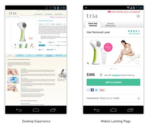
- Less is more – notice how the mobile optimized page presents images in a scrollable slideshow format rather than one large view, and several thumbnails, for easier touch-based navigation.
- Expandable content – rather than force mobile users to scroll through waves of content, one tap opens a page full of benefits which are ordinarily exposed to desktop viewers at left. Tabs that appear in blue on the Desktop version are opened via plus signs on the mobile site.
- Reviews are more prominent – notice how ratings and reviews are front-and-center on the mobile site, where more high-end purchase items are further reinforced with social proof.
- Price and payment options are larger – the price and the option to pay in installments are considerably larger so there’s no need to search for “how much it costs” or “how can I pay for it?”
- Free shipping is more noticeable –mobile shoppers see the free shipping notification immediately, along with a large, prominent icon to view their shopping cart.
- Large call-to-action button – Tria makes full use of a large call-to-action button that takes up the entire width of the screen, so there’s no pinching, squeezing and zooming to focus in on the add to cart button.
In this example, Tria has simplified, streamlined and focused on what was important for the best possible user experience, accessibility and ease of use.
What would you trim?
Here’s another example of a mobile responsive design, this time promoting the World Wildlife Foundation’s Earth Hour:
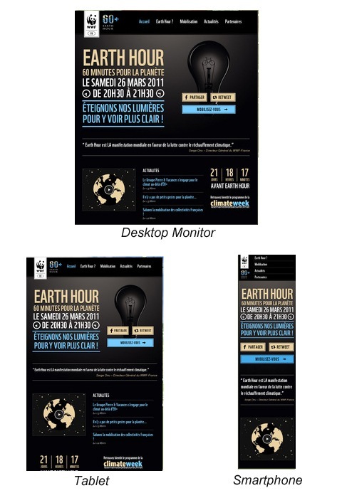
The tablet version simply shifts around elements of the site, but the smartphone version stacks them and eliminates bandwidth-sucking extras like the dim light bulb and the countdown clock. The latest news is also removed from the main focus area, which helps keep the call-to-action brief and straightforward.
But not every site cuts out the eye candy. Take a look at Food Sense. On a device where the very look of a meal could be the make or break moment to clicking through to learn more, Food Sense opted to keep their stunning images, and trim down the text:
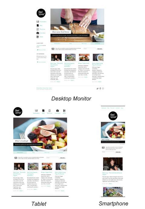
On the tablet, the sidebar navigation is moved to the top, so that browsers can enjoy the full view of the fruit salad. Smartphone users have the icons removed completely with simple text-based navigation, and greater emphasis on individual photos.
By looking at these examples, it should be clear that creating a mobile responsive design is more than just a juggling act of design elements.
The 400% increase in conversion rates
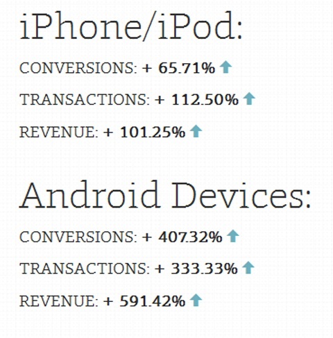
Design firm Electric Pulp recently redesigned clothing retailer O’neill’s website to be more mobile responsive. They made all the right decisions in incorporating best practices for mobile design: a fluid layout, collapsible menu that could be opened with a single tap, increased font size, larger tap areas and improved photos.
They then conducted several tests. Not your typical A/B split tests, but they instead looked at pure order volume and revenue in addition to conversions of non-mobile traffic. Here were their results:
Sometimes, mobile responsive design happens as a matter of practicality. As Shiseido Americas discovered when they launched a mobile site for their high-end beauty brand Nars in January, they simply couldn’t maintain three separate versions of their existing site (for desktop, tablet and smartphone). Switching to a more fluid design allowed them to keep pace with new device releases they weren’t prepared for, such as the iPad Mini.
In this case, Shiseido created graphics and other assets that would fit Nars’ mobile design exclusively, rather than simply rearranging elements on the existing site. The results so far have paid off in more ways than one.
They were able to increase smartphone checkout conversions by 54% and tablet conversions by 24%. In addition to that, the new approach also boosted the team’s workflow and productivity while ensuring that all device approaches use the right assets to compel the customer to take action.
Best practices for mobile forms in responsive design
Back in the ancient days of WAP, form fields were unthinkable because they were a headache to try and fill out. Fortunately, standards have changed and user interface designers have provided a well-rounded set of instructions for maximum button touch effectiveness.
UX Booth has a fantastic article on the best practices for designing and optimizing mobile forms, which includes the following:
- Using vertical-align labels (top) versus traditional left-aligned labels.
- Removing any information that isn’t absolutely necessary. Many users can have their connections dropped and data lost, making long forms difficult to complete.
- Combining form fields (such as country/state/province selection) where appropriate or making the most popular choices appear first on the list. Incorporate default selections when it makes sense to do so. This in turn makes it easy for users to quickly scan and take action without wasting a lot of time or bandwidth.
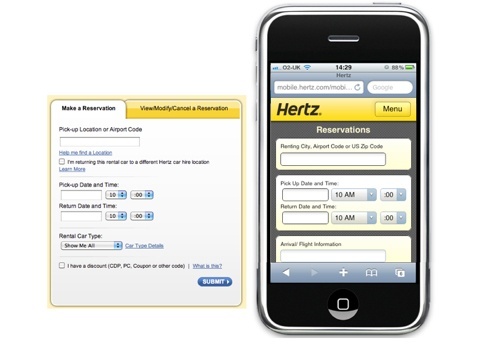
A good example of an easy to use mobile form is Hertz.
How to create your own responsive design
By this point you may be wondering, showcasing examples and results is all well and good, but how do you create your own mobile responsive design? Fortunately, there are several tools you can use to help streamline and simplify the process:
- Simple Grid – this system uses a series of “slots” that can be rearranged and combined according to a grid-based design.
- Skeleton – skeleton is a boilerplate development kit that is based on the popular 960 grid style. It also has a number of extensions for popular content management and sharing platforms including WordPress, Drupal and Github.
- Gridpak – this is a “responsive design generator” that creates a grid with a slider that you can adjust to fit your needs. You can also adjust features such as the column padding for greater control and flexibility.
- The 1140 CSS Grid – this grid is available as both CSS and a Photoshop template.
Conclusion
By starting with a fluid layout, you’ll minimize the time, cost and work of trying to fit your site to different devices, and instead concentrate on solid code that can easily be applied across devices from today, and well into the future.
The most important thing you can do to increase conversions through a mobile responsive design is to discover which features are most important to your visitors. You can do this by way of an overlaid heat map to determine where their areas of focus tend to fall. A good mobile responsive design that’s conversion focused will eliminate useless navigation and design elements, while focusing on crisp, simple design that loads fast and demands action.
Do you have a mobile responsive design? How has it affected your conversion rate?

No comments:
Post a Comment